Web Development / CSS
Tailwind CSS Cheat Sheet: 10 Visual Guides for Beginners
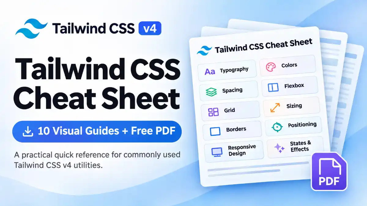
Learn and remember essential Tailwind CSS utility classes with these 10 visual guides. Explore typography, colors, spacing, layouts, responsive design, and more — then download the complete cheat sheet as a free PDF.
What Is Tailwind CSS?
Tailwind CSS is a utility-first CSS framework that lets you style websites directly in your HTML or JSX using predefined utility classes. Instead of writing separate CSS rules for every element, you combine small utility classes to create your desired design.
For example, you can use classes for background colors, spacing, typography, borders, layouts, and responsive behavior directly on your HTML elements.
<button class="rounded-lg bg-blue-600 px-5 py-2 font-semibold text-white hover:bg-blue-700">
  Get Started
</button>
Understanding the Utility Classes
Each class in the example controls a specific part of the button's appearance:
rounded-lgAdds rounded corners.
bg-blue-600Sets the background color.
px-5Adds horizontal padding.
py-2Adds vertical padding.
font-semiboldMakes the text semi-bold.
text-whiteSets the text color to white.
hover:bg-blue-700Changes the background on hover.
Why Use Tailwind CSS?
- ✓Build user interfaces quickly using utility classes.
- ✓Maintain consistent spacing, colors, and typography.
- ✓Create responsive layouts with breakpoint variants.
- ✓Style interactive states such as hover, focus, and disabled.
- ✓Reduce the need to write custom CSS for common design patterns.
Tailwind CSS is especially useful when building modern interfaces with React, Next.js, and other component-based frameworks.
Official documentation: Tailwind CSS Documentation
What You'll Find in This Tailwind CSS Cheat Sheet
Tailwind CSS provides utility classes for almost every part of modern web interface development. This guide covers ten important categories to help you understand and quickly find commonly used utilities.
Typography and Text
Text sizes, font weights, alignment, colors, line height, letter spacing, and text decoration.
Colors and Backgrounds
Text colors, background colors, gradients, background sizing, positioning, and opacity.
Margin, Padding and Spacing
Control element spacing with margin, padding, gap, and space utilities.
Flexbox and Alignment
Build flexible layouts using flex direction, alignment, justification, wrapping, and sizing.
Grid and Layout
Create structured layouts with grid columns, rows, spans, gaps, and item placement.
Width, Height and Sizing
Manage dimensions with width, height, minimum and maximum sizes, and aspect ratios.
Borders, Radius and Shadows
Style element edges with borders, rounded corners, shadows, and rings.
Positioning and Display
Understand display types, positioning, offsets, z-index, overflow, and visibility.
Responsive Design and States
Apply breakpoint-based styles and interactive variants such as hover, focus, and disabled.
Effects, Transitions and Forms
Work with opacity, filters, transitions, transforms, and form-control styling.
Each category is covered in the downloadable PDF with visual examples and commonly used utility classes. You can keep it as a quick reference while developing your projects.
Commonly Used Tailwind CSS Utility Classes
Tailwind CSS uses small, reusable utility classes to control different CSS properties. Here are some commonly used utilities that you'll encounter when building websites.
1. Typography
Control font size, weight, alignment, and text appearance.
| Class | Purpose |
|---|---|
text-sm | Small text size |
text-xl | Extra-large text size |
font-medium | Medium font weight |
font-bold | Bold font weight |
text-center | Center-align text |
leading-relaxed | Relaxed line height |
2. Spacing
Add space inside and outside elements using padding and margin utilities.
| Class | Purpose |
|---|---|
p-4 | Padding on all sides |
px-6 | Horizontal padding |
py-3 | Vertical padding |
m-4 | Margin on all sides |
mx-auto | Horizontal auto margins |
mt-6 | Top margin |
gap-4 | Gap between flex or grid items |
3. Layout
Build layouts using Flexbox, Grid, and display utilities.
| Class | Purpose |
|---|---|
flex | Creates a flex container |
grid | Creates a grid container |
grid-cols-3 | Creates three equal grid columns |
items-center | Aligns items along the cross axis |
justify-between | Distributes items with space between |
flex-wrap | Allows flex items to wrap |
hidden | Hides an element |
4. Backgrounds and Borders
| Class | Purpose |
|---|---|
bg-blue-600 | Background color |
text-white | Text color |
border | Adds a border |
border-slate-300 | Border color |
rounded-lg | Rounded corners |
shadow-md | Medium box shadow |
ring-2 | Adds a ring around an element |
5. Responsive Design and States
| Class | Purpose |
|---|---|
sm:text-lg | Applies text size from the sm breakpoint |
md:flex | Applies Flexbox from the md breakpoint |
lg:grid-cols-3 | Applies three columns from the lg breakpoint |
hover:bg-blue-700 | Changes background on hover |
focus:outline-2 | Applies an outline on focus |
disabled:opacity-50 | Changes opacity when disabled |
Practical Example: A Responsive Card
The following example combines spacing, typography, backgrounds, borders, and responsive utilities to create a simple card.
<div class="mx-auto max-w-sm rounded-xl border border-slate-200 p-6 shadow-md">
  <h2 class="text-xl font-bold text-slate-900">
    Tailwind CSS
  </h2>

  <p class="mt-3 text-sm leading-relaxed text-slate-600">
    Build modern interfaces using utility classes.
  </p>

  <button class="mt-5 rounded-lg bg-blue-600 px-4 py-2 text-white hover:bg-blue-700">
    Learn More
  </button>
</div>
These utilities are a starting point. Tailwind CSS also supports arbitrary values, custom theme tokens, and many additional variants for more advanced designs.
Understanding Responsive Design in Tailwind CSS
Tailwind CSS follows a mobile-first approach. Utility classes without a breakpoint prefix apply to all screen sizes. Responsive prefixes let you apply additional styles when the viewport reaches a specific minimum width.
Default Responsive Breakpoints
Tailwind CSS v4 provides five default breakpoint prefixes:
| Prefix | Minimum width | Typical device |
|---|---|---|
sm: | 640px | Small tablets and larger |
md: | 768px | Tablets and larger |
lg: | 1024px | Laptops and larger |
xl: | 1280px | Desktops and larger |
2xl: | 1536px | Large desktop screens |
These are the default breakpoints. You can customize them using Tailwind CSS v4 theme variables.
How Responsive Prefixes Work
Consider this example:
<div class="text-base sm:text-lg md:text-xl lg:text-2xl">
  Responsive Text
</div>
The text starts at the base size on smaller screens. It becomes larger at the sm, md, and lg breakpoints.
Practical Example: Responsive Grid
You can also change the number of grid columns depending on the available screen width.
<div class="grid grid-cols-1 gap-4 sm:grid-cols-2 lg:grid-cols-3">
  <div class="rounded-lg bg-slate-100 p-6">Card 1</div>
  <div class="rounded-lg bg-slate-100 p-6">Card 2</div>
  <div class="rounded-lg bg-slate-100 p-6">Card 3</div>
</div>
This layout displays one column by default, two columns from 640px, and three columns from 1024px.
Responsive Design Best Practices
- ✓Start with the mobile layout and add larger-screen styles when needed.
- ✓Use responsive prefixes instead of creating unnecessary custom media queries.
- ✓Test layouts at different viewport widths.
- ✓Avoid fixing widths when flexible sizing can work better.
- ✓Check text wrapping, spacing, and navigation on smaller screens.
Responsive utilities make it easier to build interfaces that provide a consistent experience across different screen sizes.
Official documentation: Tailwind CSS Responsive Design
Common Tailwind CSS Mistakes to Avoid
Tailwind CSS makes styling faster, but beginners can encounter problems when using utility classes incorrectly. Understanding these common mistakes will help you write cleaner and more maintainable code.
1. Using outdated utility classes
Tailwind CSS evolves over time. Some utilities and syntax from older versions may not be the recommended approach in newer versions.
Avoid outdated syntax:
bg-gradient-to-rUse the Tailwind CSS v4 utility:
bg-linear-to-r2. Building layouts without responsive utilities
A layout that works on a desktop may overflow or become difficult to use on a mobile screen. Use responsive prefixes to adapt layouts to different viewport sizes.
<div class="grid grid-cols-1 md:grid-cols-2 lg:grid-cols-3">
  ...
</div>
3. Using dynamically constructed class names
Tailwind scans your source files to detect class names. If you construct utility names dynamically, the scanner may not detect the complete class.
Avoid:
<div className={`bg-${color}-600`}>Content</div>Prefer complete class names:
const colors = {
  blue: "bg-blue-600",
  green: "bg-green-600",
};

<div className={colors[color]}>Content</div>
4. Repeating long utility combinations
Repeating the same lengthy class combinations across multiple components can make your code harder to maintain. Consider reusable React components or extracting repeated styles when appropriate.
5. Ignoring accessibility
Visual styling does not automatically make an interface accessible. Use semantic HTML, visible focus indicators, sufficient color contrast, and accessible labels.
<button class="rounded-lg bg-blue-600 px-4 py-2 text-white focus-visible:outline-2 focus-visible:outline-offset-2 focus-visible:outline-blue-700">
  Submit
</button>
6. Not checking the official documentation
Utility names and features can change between versions. Always refer to the official documentation when you are unsure about a class or need to check its supported syntax.
Following these practices will help you build responsive, accessible, and maintainable interfaces with Tailwind CSS.
Free learning resource
Download the Free Tailwind CSS Cheat Sheet PDF
Want all the essential Tailwind CSS utilities in one place? Download our free PDF containing 10 visual cheat sheets covering commonly used classes and important concepts.
- ✓10 categorized visual cheat sheets
- ✓Typography, colors, spacing, and layouts
- ✓Flexbox, Grid, sizing, and positioning
- ✓Responsive design, states, and effects
- ✓Useful as a quick reference while coding
Free download · PDF format · No registration required
Tips for Learning Tailwind CSS
The best way to learn Tailwind CSS is to use it while building real interfaces. Instead of memorizing hundreds of utility classes, understand how they work and practice combining them.
1. Start with the fundamentals
Learn typography, colors, spacing, borders, and sizing first. These utilities are used in almost every web interface.
2. Practice with small components
Start by creating buttons, cards, navigation bars, forms, and simple layouts. These exercises help you understand how different utility classes work together.
3. Learn responsive utilities
Practice using breakpoint prefixes such assm:,md:, andlg:to build layouts that adapt to different screen sizes.
4. Recreate existing website designs
Choose a simple website layout and try to recreate it using Tailwind CSS. This is a useful way to improve your layout and styling skills.
5. Keep the cheat sheet nearby
Use the downloadable PDF as a quick reference while coding. Look up unfamiliar utilities when you need them instead of trying to memorize every class.
6. Refer to the official documentation
Explore the official documentation to understand utilities, variants, customization, and features introduced in newer versions of Tailwind CSS.
Consistent practice will help you become comfortable with Tailwind CSS and use it more efficiently in your frontend projects.
Conclusion
Tailwind CSS makes it easier to build modern, responsive user interfaces using utility classes. Understanding commonly used utilities for typography, spacing, colors, Flexbox, Grid, and responsive design provides a strong foundation for frontend development.
This Tailwind CSS cheat sheet brings together 10 important categories in one downloadable resource. Keep the PDF handy, practice the examples, and refer to the official documentation whenever you need more details.
If you're learning frontend development or building projects with React and Next.js, Tailwind CSS is a useful tool to add to your development workflow.
Frequently Asked Questions
What is Tailwind CSS?+
Tailwind CSS is a utility-first CSS framework that provides low-level utility classes for building custom user interfaces directly in your HTML or component markup.
Is Tailwind CSS beginner-friendly?+
Yes. Beginners can start with common utilities for typography, colors, spacing, and layouts. Understanding basic CSS concepts will make learning Tailwind CSS easier.
Does this cheat sheet cover Tailwind CSS v4?+
Yes. This cheat sheet is intended as a quick reference for commonly used Tailwind CSS v4 utilities and concepts. Always check the official documentation for version-specific details.
Is Tailwind CSS better than traditional CSS?+
They serve different purposes. Tailwind CSS provides a utility-first workflow, while traditional CSS offers direct control through stylesheets. The right choice depends on your project and development preferences.
Can I use Tailwind CSS with React and Next.js?+
Yes. Tailwind CSS works with React and Next.js. You can apply utility classes directly to JSX elements and components.
What is the mobile-first approach in Tailwind CSS?+
Unprefixed utilities apply by default at all screen sizes. Responsive prefixes such as sm:, md:, and lg: apply styles from their corresponding minimum viewport widths.
Is the Tailwind CSS cheat sheet PDF free?+
Yes. You can download the 10-category visual Tailwind CSS cheat sheet PDF from this article for free.
Do I need to memorize all Tailwind CSS classes?+
No. Focus on understanding commonly used utilities and how to combine them. Use the official documentation and cheat sheet as references while building projects.
Official Tailwind CSS Resources
Want to explore more Tailwind CSS utilities and features? Refer to these official resources: